Showing posts with label pencils. Show all posts

13 June 2011

Pictures from my application

In a small flash of inspiration, today I would like to bring to you the pictures I chose to use for my application to the course! I am proud of all four of them, despite some being not the best in pure technical terms. Making some sort of transition of one of my drawings to the computer screen is as always very nearly impossible - scanners and I have never been on speaking terms, I don't know why, and taking a photo never really conveys the full amount of detail. At least, not with the camera I've got!
So here we go. The first picture is an old one; in fact, it was drawn in 2008, I think, in springtime. As so often, my linework with the pencil is thin and delicate. I drew this mostly with a... I believe it is called a "propelling pencil"? The hardness was HB. The pictures shows one of my own dreamed-up fantasy creatures, bark-skinned and twig-haired, talking to an elf in a pair of old jeans. There's a tiny owl and a small fox hidden away, though they do steal some of the viewer's attention; and also some kind of fairy lights. This one took a while to draw, and I worked on it in several sittings. It is a pity all the detail disappears in the transition to photo.
Next, we have another one of my portraits! This being the probably third or fourth that I ever dared show. Unfortunately the angle makes it look a bit odd but oh well. As you can see, my trusty Stabilo Woody crayon has done its work well here. Portrayed is a friend, Johan. The picture is very yellow, but I assure you the paper is white in real life. I originally had some trouble with his beard and some of the lines around his mouth, but then I asked him to smile, and suddenly I could see a lot better, where they were. The crayon is a somewhat blunt instrument, but it certainly covers a lot and is quicker and more efficient than, say, pencils.
Third is a finished watercolour of a meeting on a frozen lake. This was a Yule gift for a friend. I used photo reference for the nature, but freehanded the fox and the skiing little fellow that he is so curious about. I used watercolours, working mostly wet-on-dry, and finished with some white acrylics or gouache. It took an unknown amount of hours, but I remember being surprised at its taking such a relatively short time.
Fourth is a piece that is rather special to me. It is a work in progress, but I am proud of it regardless. With the help of some photo reference for the wood itself, the rest has been painted as I saw fit. A dancing Lady of the Forest, a flute-playing Lord, stick-and-twig-men, little foxes (there can never be too many foxes) and even a more current-day take on fairies. This was a real joy to paint, and a relief as well. I learned a lot about the medium itself, even while painting, and how I wished to use it. Some cue and inspiration I took from Charles Vess, and also a few tips on technique, that were most useful. In this picture it is evident some of my own personal "main points of interest" in art are, I would say. I hope to revisit this during this summer, to try and finish it. Also, I have learned a lot of colour theory which will hopefully help me avoid some of the pitfalls I was well underway of making with this one.

I hope you have enjoyed this little indulgence! For now, the main art course is over, but I shall continue painting through the summer and, hopefully, have something to show you all every now and then.

31 March 2011

Sunflower or blue iris

Out of the titular two, I chose the blue iris. I want the painting process to be filled with joy and satisfaction, and trying to paint a sunflower didn't catch my fancy. Also, there is something about them that can have me stare and look and think and ponder for hours. And yet another thing; I went to the Imperial Garden in the Meiji jingu park in Tokyo in very, very early spring, and the pond there fills up with blue iris in the summer. I've always wanted to go back and see it.

Said and done, then. I found myself a reference (despite having quitely resolved to try and NOT use reference for once, but it was a good thing I did), and set out to paint. I chose a real canvas this time, which felt exhilarating and exciting, although I felt silly feeling that - but there really is a difference between painting on a canvas board and a proper, stretched onto a frame, canvas. I started out drawing the outlines, of the flower and the leaves around it, with an HB pencil again. It was fairly straightforward.
When I started painting, I originally went with too much pink in the blend, so it turned out a wee bit too purple. I used this to good effect, however, on some areas of the flower, as they really were a lot more purple than blue. Mostly, I used Prussian Blu, but also Ultramarine Blue. I added a bit of Cadmium Red, and in fact also a pinkish red whose name escapes me - possibly Alizarin Crimson? For the yellow I looked no further than my Cadmium Yellow, which was also a key ingredient for the green.
The colours in the painting tied in really well. The blue in the iris, with a dash of red, and then the near-purple of the spots. The pure yellow didn't feel out of place because of my simply blending it and the blues I used, for the green in the background (well, I did cheat a bit here, I think I used some Viridian or Sap Green too, but mostly I blended the greens myself). And the white goes a bit of everywhere, where it is needed.
And here it is. I think I captured the vibrancy of the colours fairly well with the camera this time, but it's going to be interesting to see it fully dry! Here, it's been drying for a week. I painted it in, well, several hours, but mostly during two days. Started in the middle of the night and went up early to continue. I couldn't resist it!
I think I could have taken a bit less of a look on the reference photo - it's a very good likeness, but I should have thought for myself, too, to make it look more "real". As it is, some areas of the flower look almost flat, though I know that in reality they aren't - of course. Again, I used a lot of blending. It's really one of my favourite ways of making things look smooth... Pity I'm not better at it, when it comes to watercolours! But I'll get to that in time, I suppose. In real life, the painting gets a bit of texture from my using a fairly thick layer just about everywhere, but it is especially apparent with the yellow areas. They do look a bit knobbly, just as they should. I mostly used flat brushes, and preferably with a bit longer hairs. I'm thinking of getting a "fan" or "feather" brush, since I think it'd be interesting to try and paint with.
Once again, I'm very happy with this, and I hope I'm have some nice spot on a wall to hang it!

22 March 2011

From sketch to finished painting

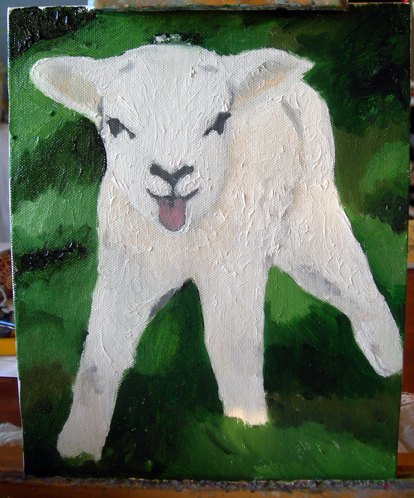
I have a tendency to forget to stop and take pictures of in-progress paintings (and drawings). So being forced to do so was a very good excercise. I figured I would try and be inspired by the seasons, this time, and lo, few things so symbolise it to me as little baaah-lings, that is lambs, and their bleating. I was thinking of adding a small faery or something to the picture, but completely forgot in the joy of finding such a cute subject without much effort anyway. I used an F3 canvas board and oils, which I had been itching to do for quite some time. In fact, itching so much that you will see I made all three or four weeks' worth of assignments in almost one go (I think I finished them all in a week).
I found myself a nice reference picture (I was looking for one with black head and grey wool but found this delightful little fella) and set about it. First, sketching with an HB pencil (I find 2B smudges too much when painting over it on canvas and the like) the outlines of the little lamb, and also some of the shadows. In hindsight it would have been better to choose a more colourful picture, and one with more contrasts. Next time, next time.
Then, I brought out grandmothers charcoal and filled in the shadows, marking them properly. This, again, told me that another subject would have been better as charcoal does smudge something terrible and I was painting an awful lot of bright or pale colours. Regardless, filling in the shadowed parts a bit more is a good way of adjusting the eyes and mind to remember that here be shadows. (Another interesting thing to note is how the light changes throughout the pictures - I prefer to paint during daytime, to make use of natural light, but since the light itself changes and so do colour values throughout the day, until it becomes, even with lamps, too dark, it's not always without its faults or troubles). (It also makes it easier to get a proper representation of the colours when you photograph a painting, something which has made me gnash my teeth both once and twice. They look so great in real life, but transferring them to the screen is another matter).
I started out painting the main subject, the lamb itself. Mainly because it consisted of pale colours and a lot of white mixed in (but very few areas are actually completely white - one of the interesting things with white is that you have to paint other colours in order to make it look white, especially shadows), but also because I had a fair idea of how I was going to paint it, whereas with the grass I was uncertain as to how best go about it. As you can see, I began by working from the groundwork I had already done, filling in shadowed or more obviously coloured areas first, as well as covering with various shades of white. I am currently using a mixed-white oil colour, to get some kind of the best of both worlds. Titanium white really dries slowly, but it has a lovely shade of white.
Smoothing out some sharp lines, I then went on with the grass, trying to catch the general colour. All in all it became much too dark, so as you will see, I worked to lighten it up and also to try and get some of the blatant green-ness out of it.
Again, I worked in my seemingly usual way: Fill in the large areas, then add details. I've a hard time painting with any kind of pointillist technique, but maybe next time... Between the first and the second picture with the grass painted, I took a pause overnight. Once again the delight (and annoyance, more on that later) that is the fact that oils doesn't dry immediately, helped. I could pick up my brushes the next day and without problem use a technique I am very fond of; wet in wet, blending colours seamlessly. Then came a few hours of dabbing here and there to start giving it a bit more of texture (once again something oils excel at, though at times I find that certain artists use it carelessly and much too extensively, creating a muddy and clotted image), filling in shadows that I accidentally made too light, looking critically between painting and reference, looking up new audiobook chapters of "Harry Potter and the Order of the Phoenix" (I have to grit my teeth, I admit, to get through it - few times I have wanted so badly to do bad things to fictional characters but Umbridge, oh dear...), switching madly between brushes to get the right look for the grass and avoid using brushes with green colour on areas of white.
Colour constancy is an interesting subject, and suffice to say that a bit of reading and research on the matter helped immensely in making me realise that I needed a lot of brown in the green grass. Said and done, and suddenly everything got a lot better.
I used almost pure Ivory Black on the eyes and nose, I think I blended in a bit of brown though, and as you can see in some areas the nose is blended rather than monochromatically black beside white. And despite them not being there in the reference, there is a white dot in both eyes, to give them more life. Old painter's trick.
The difference between near-finished and final is, in some areas, almost startling. The tongue is a lot more lifelike, shadows and texture are suddenly visible, and I did in fact mellow the line between nubs of horns and hair on top of the lamb's head a bit, after the final picture was taken. Now it's lying on the top shelf of a cupboard just to try and keep it out of the way until it dries. Which will take several weeks. So, there we have the downside with oils not drying quickly - you have to keep them safe until they are dry, otherwise the paint will get everywhere and the painting will be ruined, and oil colour stains are rather tricky to get out of fabric and clothes.

All in all, I am very, very happy with this very cute picture of a bleating lamb. I look forward with putting this up on a wall, but I'll have to cover it with glass, or it'll be ruined from me trying to cuddle it. In real life it is cute as a button! So yes, once again I do myself proud. I'm again hesitant to call it impressionist, but I'll leave that to others to say if it is or isn't. Tell me and I'll happily revise the tags.
It took me more or less two full days to paint, and having smell-free brush-cleaner was vital. On a sidenote, I also use this to thin the paints, as I do with water and acrylics. I have had comments on me somehow managing to paint very thin colours, but I suppose it's part of my own expression, maybe?

16 February 2011

Drawings, with pencil and ink

The next assignment for the art course was drawing. Drawing with pencils, and drawing with something else - "experiment!" they encouraged us. So... I did. This is the medium I've been using the longest, and you can see the progress throughout the many varying drawing pads I've been using. But there are certain things that show it's an "Ellie". First out, a recent favourite of mine - drawing portraits! It's challenging and fun! The first I dared show anyone, I drew just earlier this winter. This, however,
is a portrait of Erik, reading the excellent book "Tigana" by Guy Gavriel Kay. It's made mainly with a 2B pencil, but 4B and 6B played important parts in making the darker parts, well, darker. Such as the hair. I used a stompf to good effect, too, but I think I might go back and revise a few parts. The stubble on the chin wouldn't look too bad being a bit darker. All in all, however, I'm happy with this. It took a good hour... two hours? I have no idea. I just go into mushin/munen-mode and come out afterwards. (That means, no-mind). I do admit I didn't care too much about the top of his shirt, or his necklace... To add too much detail would have drawn attention away from the main thing here. (That's as good an excuse as any!) I wish the light sources would have been a bit more interesting, as it was, I had a window from sort of behind-beside his head, and then a lamp from behind me. Would have liked one from above, to create more interesting shadows in the face, and show off the cheekbones a bit more. I did have to correct his head pose a few times; this is, I guess, one of the reasons why his lips and nose look a bit small and pointed, I didn't get the exact same angle every time I did.

For the next picture I figured I'd give myself a challenge, again. I set up a nice little still life, with a teacup, a character sheet from an RPG and some dice. And a pen.
And it turned out just as drab, boring and wonky as could probably be expected. So my eye caught a kimono on a hanger on a wall, and I figured... this could work. I started out drawing the first lines for it with my 2B pencil, and marking in some shadows. Next step was to pick up my Japanese calligraphy brush - not a proper brush, where I make the ink myself, unfortunately, but a ready-made one, with ink in the pen shaft. The brush was fairly dry, and I kept it that way, to have an easier time making softer shadows. There was no way I could properly capture the wonderful interwoven pattern in the dark-blue kimono fabric, but the obi decoration was far easier! I thoroughly liked working with the ink, and added a bit of my trusty, wonderful Stabilo Woody crayon/pencil. Mixing mediums is fun, even if it's not that apparent here. Also, I think that if I went completely to scale with things, there'd be nothing more than the kimono in this picture... so I shrank the distances to the doorways and the odd fan-thing above. Made it more interesting.
The walls are really a disgusting terracotta colour which I DETEST and cannot understand why everyone had to furnish their poor living rooms with, but there you are, and those living in said apartment, aren't really going to change it either. After all, painting walls is not half as fun as painting pictures, and it's a big bother too. No, causing your walls to have that terracotta colour is a lesser crime against humankind, I'd say. One it DOESN'T deserve.

The paper on which these were drawn was that old hate-friend of mine, an A4-sized one. The drawing pad is called "Teckning" which means "Drawing", and it's 40 pieces of paper, 140 grams heavy. Despite being a rather bleached white, it's supposed to be environmental friendly. My pencils are Derwent Graphic pencils, and, as you've guessed by now, I mostly use 2B. I started doing this after I read something about using that hardness for pre-watercolour drawings, and then heard John Howe (of Lord of the Rings drawing fame) say, during a highly amusing talk which I'm sad you miss out on but I cannot remember the url, that he'd recently upgraded from 2B to 4B. And I really like it. I also use a kneadable eraser, it's very useful, and of course an ordinary one as well. I am using a fairly small stompf, but it's much easier to get the control over smudges that I want, than with fingers alone.

I have, of course, drawn several more things. I might show them off, in particular, one or two profile drawings in pencil and with the Woody crayon. Also, I guess I should show you, how a table might look, after I'm done with a painting.