31 March 2011

Sunflower or blue iris

Out of the titular two, I chose the blue iris. I want the painting process to be filled with joy and satisfaction, and trying to paint a sunflower didn't catch my fancy. Also, there is something about them that can have me stare and look and think and ponder for hours. And yet another thing; I went to the Imperial Garden in the Meiji jingu park in Tokyo in very, very early spring, and the pond there fills up with blue iris in the summer. I've always wanted to go back and see it.

Said and done, then. I found myself a reference (despite having quitely resolved to try and NOT use reference for once, but it was a good thing I did), and set out to paint. I chose a real canvas this time, which felt exhilarating and exciting, although I felt silly feeling that - but there really is a difference between painting on a canvas board and a proper, stretched onto a frame, canvas. I started out drawing the outlines, of the flower and the leaves around it, with an HB pencil again. It was fairly straightforward.
When I started painting, I originally went with too much pink in the blend, so it turned out a wee bit too purple. I used this to good effect, however, on some areas of the flower, as they really were a lot more purple than blue. Mostly, I used Prussian Blu, but also Ultramarine Blue. I added a bit of Cadmium Red, and in fact also a pinkish red whose name escapes me - possibly Alizarin Crimson? For the yellow I looked no further than my Cadmium Yellow, which was also a key ingredient for the green.
The colours in the painting tied in really well. The blue in the iris, with a dash of red, and then the near-purple of the spots. The pure yellow didn't feel out of place because of my simply blending it and the blues I used, for the green in the background (well, I did cheat a bit here, I think I used some Viridian or Sap Green too, but mostly I blended the greens myself). And the white goes a bit of everywhere, where it is needed.
And here it is. I think I captured the vibrancy of the colours fairly well with the camera this time, but it's going to be interesting to see it fully dry! Here, it's been drying for a week. I painted it in, well, several hours, but mostly during two days. Started in the middle of the night and went up early to continue. I couldn't resist it!
I think I could have taken a bit less of a look on the reference photo - it's a very good likeness, but I should have thought for myself, too, to make it look more "real". As it is, some areas of the flower look almost flat, though I know that in reality they aren't - of course. Again, I used a lot of blending. It's really one of my favourite ways of making things look smooth... Pity I'm not better at it, when it comes to watercolours! But I'll get to that in time, I suppose. In real life, the painting gets a bit of texture from my using a fairly thick layer just about everywhere, but it is especially apparent with the yellow areas. They do look a bit knobbly, just as they should. I mostly used flat brushes, and preferably with a bit longer hairs. I'm thinking of getting a "fan" or "feather" brush, since I think it'd be interesting to try and paint with.
Once again, I'm very happy with this, and I hope I'm have some nice spot on a wall to hang it!

23 March 2011

Colour-study of an apple

This art blog has been mercifully free of still lives, but this time I came pretty close. The assignment had to do with colour constancy and what we expect to see for a colour, and what colour is really there. I rolled up a paper into a small tube, and took it for a help while painting an apple.
Again, oil colours were used as a medium, with the help of some odourless paint cleaner and thinner-thingumajing. I worked on my favourite the F3 canvas board, and used a red apple on white-ish fabric for a subject.
The thing I found most tricky were the spots of highlight - they changed depending on light-source, of course, and looks very strong in the picture.

To my defence I'd like to say that I have since the photo was taken, gone over them a bit with a brush, so that they are now a lot less stark white and look much better. The real apple was moved from where I painted it, to where I took the photo, hence the differences in light and perspective and all. All in all it was a good excercise. It was particularily interesting to try and incorporate the shine caused by the bright cloth underneath, to work with uneven shadows, and to figure out how much blue versus yellow was needed for the not entirely pure red areas. But I've always had it easy with the yellow-to-red part of the colour spectrum, so it wasn't very hard to do this.
I might redo this, with an orange or something, and perhaps a blue cloth or something, just to give me a bit of a challenge (blue and orange being opposites on a colour wheel).
Pity, again, that the picture made the granulated canvas board look really odd, but oh well.

22 March 2011

From sketch to finished painting

I have a tendency to forget to stop and take pictures of in-progress paintings (and drawings). 
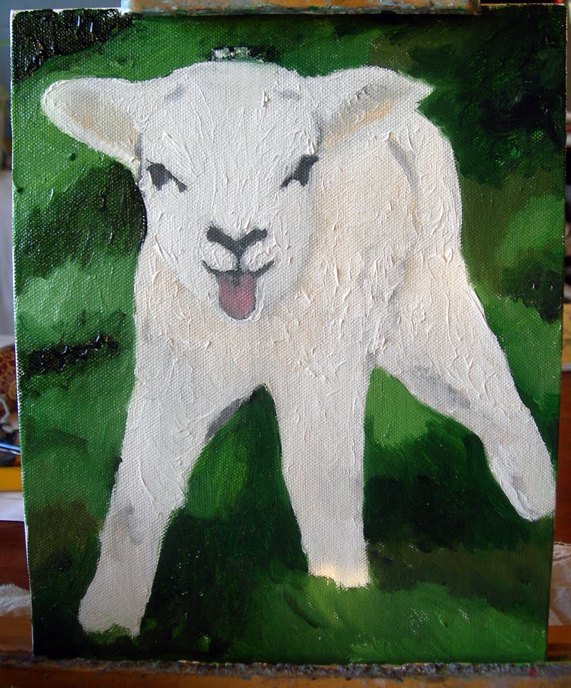
So being forced to do so was a very good excercise. I figured I would try and be inspired by the seasons, this time, and lo, few things so symbolise it to me as little baaah-lings, that is lambs, and their bleating. I was thinking of adding a small faery or something to the picture, but completely forgot in the joy of finding such a cute subject without much effort anyway. I used an F3 canvas board and oils, which I had been itching to do for quite some time. In fact, itching so much that you will see I made all three or four weeks' worth of assignments in almost one go (I think I finished them all in a week).
I found myself a nice reference picture (I was looking for one with black head and grey wool but found this delightful little fella) and set about it. First, sketching with an HB pencil (I find 2B smudges too much when painting over it on canvas and the like) the outlines of the little lamb, and also some of the shadows. In hindsight it would have been better to choose a more colourful picture, and one with more contrasts. Next time, next time.
Then, I brought out grandmothers charcoal and filled in the shadows, marking them properly. This, again, told me that another subject would have been better as charcoal does smudge something terrible and I was painting an awful lot of bright or pale colours. Regardless, filling in the shadowed parts a bit more is a good way of adjusting the eyes and mind to remember that here be shadows. (Another interesting thing to note is how the light changes throughout the pictures - I prefer to paint during daytime, to make use of natural light, but since the light itself changes and so do colour values throughout the day, until it becomes, even with lamps, too dark, it's not always without its faults or troubles). (It also makes it easier to get a proper representation of the colours when you photograph a painting, something which has made me gnash my teeth both once and twice. They look so great in real life, but transferring them to the screen is another matter).
I started out painting the main subject, the lamb itself. Mainly because it consisted of pale colours and a lot of white mixed in (but very few areas are actually completely white - one of the interesting things with white is that you have to paint other colours in order to make it look white, especially shadows), but also because I had a fair idea of how I was going to paint it, whereas with the grass I was uncertain as to how best go about it. As you can see, I began by working from the groundwork I had already done, filling in shadowed or more obviously coloured areas first, as well as covering with various shades of white. I am currently using a mixed-white oil colour, to get some kind of the best of both worlds. Titanium white really dries slowly, but it has a lovely shade of white.
Smoothing out some sharp lines, I then went on with the grass, trying to catch the general colour. All in all it became much too dark, so as you will see, I worked to lighten it up and also to try and get some of the blatant green-ness out of it.
Again, I worked in my seemingly usual way: Fill in the large areas, then add details. I've a hard time painting with any kind of pointillist technique, but maybe next time... Between the first and the second picture with the grass painted, I took a pause overnight. Once again the delight (and annoyance, more on that later) that is the fact that oils doesn't dry immediately, helped. I could pick up my brushes the next day and without problem use a technique I am very fond of; wet in wet, blending colours seamlessly. Then came a few hours of dabbing here and there to start giving it a bit more of texture (once again something oils excel at, though at times I find that certain artists use it carelessly and much too extensively, creating a muddy and clotted image), filling in shadows that I accidentally made too light, looking critically between painting and reference, looking up new audiobook chapters of "Harry Potter and the Order of the Phoenix" (I have to grit my teeth, I admit, to get through it - few times I have wanted so badly to do bad things to fictional characters but Umbridge, oh dear...), switching madly between brushes to get the right look for the grass and avoid using brushes with green colour on areas of white.
Colour constancy is an interesting subject, and suffice to say that a bit of reading and research on the matter helped immensely in making me realise that I needed a lot of brown in the green grass. Said and done, and suddenly everything got a lot better.
I used almost pure Ivory Black on the eyes and nose, I think I blended in a bit of brown though, and as you can see in some areas the nose is blended rather than monochromatically black beside white. And despite them not being there in the reference, there is a white dot in both eyes, to give them more life. Old painter's trick.
The difference between near-finished and final is, in some areas, almost startling. The tongue is a lot more lifelike, shadows and texture are suddenly visible, and I did in fact mellow the line between nubs of horns and hair on top of the lamb's head a bit, after the final picture was taken. Now it's lying on the top shelf of a cupboard just to try and keep it out of the way until it dries. Which will take several weeks. So, there we have the downside with oils not drying quickly - you have to keep them safe until they are dry, otherwise the paint will get everywhere and the painting will be ruined, and oil colour stains are rather tricky to get out of fabric and clothes.

All in all, I am very, very happy with this very cute picture of a bleating lamb. I look forward with putting this up on a wall, but I'll have to cover it with glass, or it'll be ruined from me trying to cuddle it. In real life it is cute as a button! So yes, once again I do myself proud. I'm again hesitant to call it impressionist, but I'll leave that to others to say if it is or isn't. Tell me and I'll happily revise the tags.
It took me more or less two full days to paint, and having smell-free brush-cleaner was vital. On a sidenote, I also use this to thin the paints, as I do with water and acrylics. I have had comments on me somehow managing to paint very thin colours, but I suppose it's part of my own expression, maybe?

09 March 2011

Two projects after my own ideas

The task was to paint two paintings; with subject and tools of your own choice. Still not having access to my oils, I went for acrylics again, and started out with a canvas board of the size F2. I had a vague idea for what I wanted to do, and it boiled down to what you can see on the right. I looked for a nice photo of a bus stop, and it had to be in Edinburgh. Eventually, I found one on the Lothian Buses website, I think, or somewhere similar, and it fit what I wanted to do. Originally I was going to have the girl stand up, leaning on the signpost, but that would have disturbed the picture rather than add to it. Having her sit down, and on a big old trunk, made it more coherent. You can still see the things that make the picture just that degree of odd: her satyr legs and horns. I used acrylics, and after my first bout with the picture I wasn't too happy with it. But then I came to an important realisation: I didn't NEED it to look perfect right away. I was going to come back to it and work on it again and again, and after many times and many hours, it would look better. That was a very important piece of insight.

I worked with flat brushes a lot for the larger areas, but then went over to smaller, round brushes, with rather long hairs. I found some incredibly cheap and sturdy little brushes at an art shop, that work perfectly well for how I treat them and use them. The trees to the right of Waverley Bridge (which connects Old Town and New Town in Edinburgh, and is the place where I first arrived to, by, incidentally, bus) were almost stippled, and I had a hard time at first finding the right balance between photo reference, suitability for the overall picture and what colours would actually look good. The puddles of water were something I fretted about, as I couldn't seem to do them justice, but they are done well enough, I suppose. I did try to make the painting tell a bit of a story, though you can't see her facial expression very well from the photo. Nor are the colours as nice as they are in real life but that is all right. That's a greater issue with my next picture than with this one. I call it "Waiting for the bus" by the way, and it's my first properly "urban fantasy" painting, I guess. Next time I decide to go for these tiny detials, however, it'll be a no-grain paper for me, or oils. I might also work on this more in the future, but we'll see. I started by sketching with pencils, and then work from larger areas to small detail.

Here we have the picture that came into my mind, and I couldn't wait to paint it. It's acrylics on a 24 by 32 cm paper from a Canson cold pressed, four side glued block for acrylics. I started out by grabbing a round, thin brush and a piece of Process Blue (cyan), to quickly sketch the outline of the bird. It's a phoenix, known as Fushichou 不死鳥 in Japanese (the signs mean respecitely "un-, non-", "death, dying" and "bird"), and it was lovely to go haywire with colours, and to make use of the great delight I take in painting fire and all variants of it. Fire, you see, needs some study to be able to paint it properly. Here, I have used both the "real" way that fire is built, and the "perceived" way. In the very inner core, some white that is almost blue, and then, darker as we go further away from the source of the flame. Yet it seems sometimes that it is the very outer parts that are the brightest, and indeed, in some cases, flame does go from bright, not as bright, dark and then brighter again, before the air takes over. The picture is life and motion, is rebirth and is a riot of colours. Once I had finished the bird itself, I knew I needed to bravely venture into the realms of background and so I did. With a bit of some blue-tinged green, I started out from black and then went head to toe with the fact that I'd painted real pretty wings... and that I'd have to try and keep the flamey aspects of them. Drybrush, an old friend of miniature painters worldwide, became part of the solution, and then I just added more and more green, and diluted it with water until the very core, which is pure Titanium White. Some parts are better blended than others but all in all it was a very good result, compared to expectations.

It is very difficult to capture this in a photo, but I went off to my figure case and brought out Games Workshop's Shining Gold and Burnished Gold. Adding a dash of these metallic paints to some parts gave the picture the finishing touch I wanted. It brings it to life in a whole different way. I think I missed going over the detail shot in Photoshop however, but oh well, there you go. I forgot to sign the pictures too, before I brought out the camera.
I also, incidentally, used the colour Red Gore from the GW range, as it is an old-time favourite anyway, and I simply didn't manage to get the right red, when I tried blending colours. Those colours come in small pots, and are acrylics too. In the very darkest recesses of its wings, I used black with some Red Gore in it, and the loose flames emanating from the wings are painted with Cadmium Yellow Lemon or somesuch over Process Yellow, with a dash of white in some.
I am very, very happy with this picture. I learned a lot from making it. The joyous expression in the phoenix's face, the swirly feeling of movement, the composition, the balance between colours and lines and details; yes, I can safely say I am very proud.

As per usual these days, I was listening to Harry Potter audiobooks while painting. For these two, I had reached "Harry Potter and the Goblet of Fire" which, to my immense happiness, proved to be as good as I remembered it - not as good as my favourites of the series, but so very much better than the poor movie. And Fawkes, Albus Dumbledore's phoenix, makes an appearance in it.

That will be enough rambling from me. I hope you enjoy these my latest projects, and I am also proud to say that I feel confident enough now to take on some kind of commissions. As of yet, payments for them are not standardised but will be dealt with on a case-to-case basis. I hope that what I have posted here so far shows some extent of my versatility. I enjoy painting thoroughly, whether it flows easy or presents me with tricksy obstacles.